Configuration > Brand Settings > Content Defaults > Content Blocks
Below the Global Design Tokens section, each content block type has its own configuration card. These cards let you fine-tune the default appearance of specific block types — overriding Global Token values where needed — so that new blocks dropped into the editor arrive styled exactly the way you want.
Working with Content Block Cards
Six content block types are available: Text, Button, Image, Divider, Menu, and Form. Each appears as a collapsible card below the Global Design Tokens section.
Each card includes:
- An enable/disable toggle — disabled block types are excluded from your configuration. Only enabled blocks have their defaults applied in the editor.
- A mini preview thumbnail showing the block's current appearance when the card is collapsed.
- The full set of configurable properties when the card is expanded.
When you expand a card, the corresponding block in the live preview panel is highlighted so you can see the effect of your changes.

Inheritance and Overrides
Many properties within each block card inherit their value from a Global Design Token. For example, the Text block's font family inherits from the Primary Font token, and its text color inherits from the Text Color token.
Inherited properties display a small indicator showing which Global Token they come from. When you change an inherited property to a different value, it becomes an override — the property decouples from the Global Token and retains its custom value even if the token changes later.
Overridden properties display a Reset to global link. Clicking this link clears the override and re-establishes inheritance from the Global Token.

Copy From
Many properties include a Copy from control that lets you pull a value from another block's corresponding property. For example, you can copy the Text block's link color to the Menu block's link color, or copy one block's padding to another. This is useful when you want consistency across blocks without manually entering the same value in multiple places.
Advanced Options
Each block card includes an Advanced section that reveals additional properties. These are settings that most users will not need to adjust but are available for fine-tuning. Click Show advanced options to expand the section, or Hide advanced options to collapse it.
Advanced options typically include line height, letter spacing, text alignment, mobile visibility toggles, and mobile-specific padding overrides.
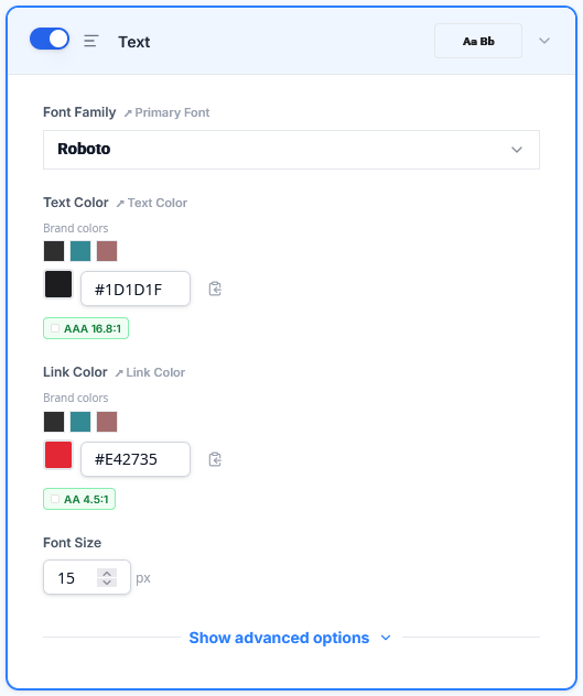
Text Block
The Text block controls the default appearance of text and paragraph blocks dropped into the editor, as well as heading styles.
Primary properties:
- Font Family — inherits from Primary Font
- Text Color — inherits from Text Color
- Link Color — inherits from Primary Color
- Font Size — default size for body text
Advanced properties:
- Line Height — vertical spacing between lines of text
- Text Alignment — Left, Center, or Right
- Block Padding — inherits from Block Padding
Heading Overrides (H1–H6): Within the Advanced section, expandable sub-sections let you configure each heading level independently. Each heading level supports font family (inherits from Heading Font), font size, font weight, text color, link color, line height, text alignment, and letter spacing. You can add heading levels beyond H3 using the Add button, up to H6.
Mobile / Visibility:
- Hide on Mobile — prevents this block type from rendering on mobile devices
- Override Padding on Mobile — enables a separate padding value for mobile viewports
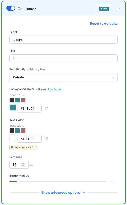
Button Block
The Button block controls the default appearance of button blocks, including hover states.
Primary properties:
- Label — default button text
- Link — default button URL
- Font Family — inherits from Primary Font
- Background Color — inherits from Primary Color
- Text Color — the color of the button label text
- Font Size — button label size
- Border Radius — controls how rounded the button corners are (0 = square, higher values = more rounded)
Advanced properties:
- Font Weight — weight of the button label text
- Border — width, style, and color of the button border
- Inner Padding — space between the button label and the button edge
- Width — Auto, Full Width, or a custom percentage
- Alignment — Left, Center, or Right
- Block Padding — inherits from Block Padding
Hover Styles: An optional section that lets you define how the button appears when a user hovers over it. Enable the toggle to configure hover text color, hover background color, and hover borders (per side).
Mobile / Visibility:
- Hide on Mobile — prevents this block type from rendering on mobile devices
- Override Padding on Mobile — enables a separate padding value for mobile viewports
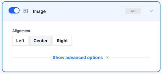
Image Block
The Image block controls the default layout of image blocks.
Properties:
- Alignment — Left, Center, or Right
- Block Padding — inherits from Block Padding
Mobile / Visibility:
- Hide on Mobile — prevents this block type from rendering on mobile devices
- Override Padding on Mobile — enables a separate padding value for mobile viewports
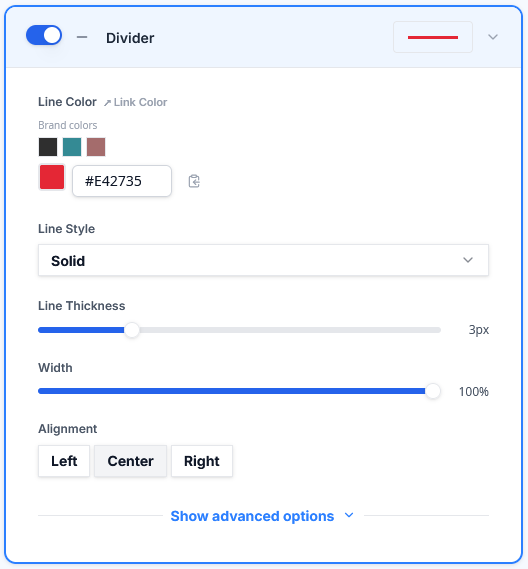
Divider Block
The Divider block controls the default appearance of horizontal divider lines.
Properties:
- Width — the percentage of the content area the divider spans (0–100%)
- Line Thickness — the thickness of the divider line in pixels
- Line Style — Solid, Dashed, or Dotted
- Line Color — the color of the divider line
- Alignment — Left, Center, or Right
- Block Padding — inherits from Block Padding
Mobile / Visibility:
- Hide on Mobile — prevents this block type from rendering on mobile devices
- Override Padding on Mobile — enables a separate padding value for mobile viewports
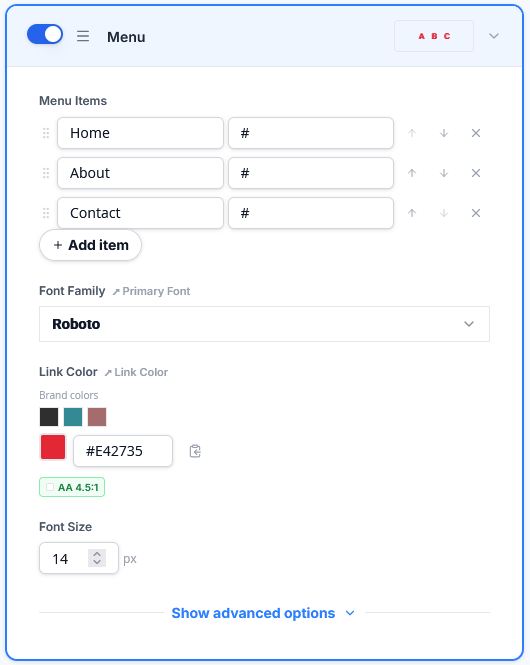
Menu Block
The Menu block controls the default appearance of navigation menu blocks.
Properties:
- Font Family — inherits from Primary Font
- Font Size — size of menu link text
- Link Color — inherits from Primary Color
- Text Alignment — Left, Center, or Right
- Menu Items — default menu items with text and link for each
- Items Spacing — padding between individual menu items
- Block Padding — inherits from Block Padding
Hamburger Menu: Configure the mobile hamburger menu behavior:
- Enable on Mobile — toggles whether the menu collapses into a hamburger icon on mobile
- Icon Color — the color of the hamburger icon
- Background Color — the background behind the hamburger icon
- Icon Size — the size of the hamburger icon
- Icon Type — Normal or Rounded
Mobile / Visibility:
- Hide on Mobile — prevents this block type from rendering on mobile devices
- Override Padding on Mobile — enables a separate padding value for mobile viewports
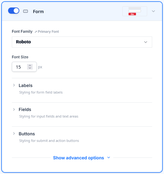
Form Block
The Form block controls the default appearance of form blocks used in landing pages. The Form block editor is organized into three sub-sections — Labels, Fields, and Buttons — plus block-level properties.
Block-level properties:
- Font Family — inherits from Primary Font
- Font Size — base font size for the form
- Font Weight — base font weight
- Alignment — overall form alignment
- Block Padding — inherits from Block Padding
- Block Background Color — optional background color behind the entire form block
Labels sub-section:
- Color — label text color
- Line Height — vertical spacing for label text
- Font Weight — weight of label text
- Font Style — normal or italic
- Alignment — label text alignment
- Position — whether labels appear above (Top) or beside (Left) their fields
- Letter Spacing — space between characters in labels
- Min Width — minimum width for labels when using the Left position
Fields sub-section:
- Text Color — color of text entered into form fields
- Background Color — field background fill
- Outline / Focus Color — the color of the field border when focused
- Border — width, style, and color of the field border
- Border Radius — how rounded the field corners are
- Padding — space between the field text and the field edge
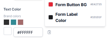
Buttons sub-section:
- Text Color — button label color
- Background Color — button fill color
- Border — width, style, and color of the button border
- Border Radius — how rounded the button corners are
- Line Height — vertical spacing within the button
- Alignment — button alignment within the form
- Width — button width
- Max Width — maximum button width as a percentage
- Padding — space between the button label and the button edge
- Margin — space between the button and surrounding form elements
Mobile / Visibility:
- Hide on Mobile — prevents this block type from rendering on mobile devices
- Override Padding on Mobile — enables a separate padding value for mobile viewports
Next Steps
Once your content block defaults are configured, save your changes to apply them. You can also explore preset themes for a quick starting point, or learn about importing and exporting configurations in the next article.
