Configuration > Brand Settings > Content Defaults > Global Design Tokens
Global Design Tokens are the foundational brand values that cascade into all content block types. Setting these tokens is the fastest way to get your brand applied across the entire editor — configure them once, and every content block inherits sensible defaults automatically.
Understanding Global Tokens
Global Tokens sit at the top of the Content Defaults configuration panel. They define your brand's core visual properties — fonts, colors, content width, and spacing. When a Global Token changes, every per-block property that inherits from it updates immediately, both in the configuration panel and in the live preview.
Properties that have been explicitly overridden at the block level are not affected by Global Token changes. This lets you set broad brand defaults while still fine-tuning individual block types where needed.
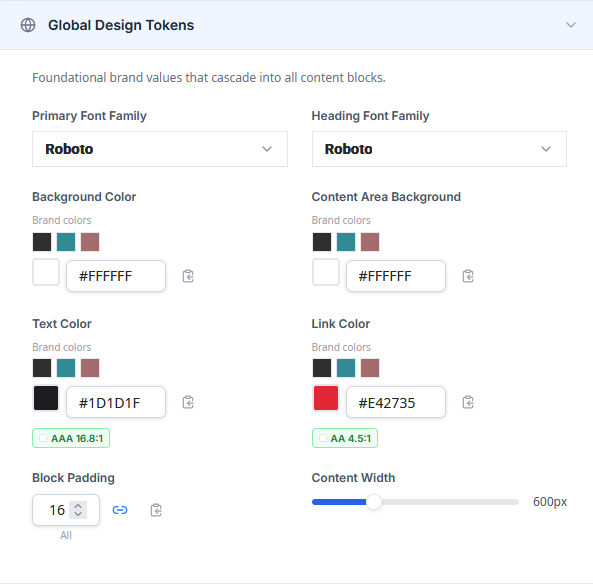

Primary Font Family
Sets the default font used for body text, buttons, menu links, and other text-based content blocks. Select a font from the dropdown. The available fonts depend on your Colors & Fonts configuration:
- In preferred fonts mode, only your preferred and custom fonts appear.
- In all fonts mode, the full font library is available, including standard system fonts and Google Fonts.
Custom fonts added in the Colors & Fonts tab also appear in this picker.
Heading Font Family
Sets the default font used for headings (H1 through H6) in the Text content block. This allows you to use a different font for headings than for body text — a common brand pattern. The same font selection rules apply as for the Primary Font.
Primary Color
Sets the default accent color used across content blocks. This token cascades to button background colors, link colors, and other accent properties. Select a color using the hex input or choose from your brand color swatches.
Text Color
Sets the default body text color. This cascades to the text color property on all content block types that display text.
Each color picker in the Global Tokens section includes a WCAG contrast ratio badge that indicates the accessibility of the text color against the content area background. The badge displays one of three levels:
- AAA — Excellent contrast. Meets the highest WCAG readability standard.
- AA — Good contrast. Meets the WCAG minimum for normal-sized text.
- Fail — Low contrast. Does not meet WCAG accessibility standards.
Background Color
Sets the outer page background color for new designs. This is the color that appears behind the content area in the email or landing page. It is visible in previews and in the final sent email, though it may not render on the editor canvas itself.
Content Area Background
Sets the background color of the content area — the main body of the email where content blocks are placed. This color is distinct from the outer Background Color and is visible both in the editor and in the final output.
Content Width
Controls the width of the content area in new designs. Use the slider to set a value between 480px and 900px. The default is 600px, which is the standard width for most email clients.
Block Padding
Sets the default padding applied to all content blocks. Padding controls the space between a block's content and its outer edge. The control supports two modes:
- Linked mode (default) — all four sides (top, right, bottom, left) share the same value. Adjusting one side updates all four.
- Unlinked mode — each side can be set independently. Click the link icon between the inputs to toggle between modes.


How Cascade Works
The cascade model is central to how Global Tokens interact with per-block settings. Here is how it works:
When you set a Global Token, that value flows down to every block property that inherits from it. For example, changing the Primary Font updates the font on the Text, Button, and Menu blocks simultaneously.
If you override a property at the block level (for example, setting the Button font to something different from the Primary Font), that property decouples from the Global Token. Future changes to the Primary Font will not affect the Button font.
Overridden properties display an indicator showing which Global Token they inherit from and a Reset to global link. Clicking this link removes the override and re-establishes inheritance, immediately picking up the current Global Token value.
The live preview reflects the cascade in real time. As you adjust a Global Token, watch the preview to see which blocks update and which retain their overridden values.

Next Steps
Once your Global Tokens are configured, you can proceed to configuring individual content block defaults for more granular control, or save your configuration to start using your brand defaults immediately.
