Following these best practices will help ensure you are able to design your emails to cover the vast array of email clients and devices being used to view emails today.
To summarize, here are some key best practices: (we have separate articles on each element below - if you want to dig deeper)
- Email Structure – Content width is 600px and footer contains proper links/info for SPAM compliance.
- Responsive Design – Columns stack left to right and all elements in a single row/column will stack first. Use the “Hide on” desktop/mobile feature for more complex content blocks.
- Image Optimization – Make sure your images are sized correctly for the content section, are 2x size for apple devices and have a consistent aspect ratio so they scale to the same size when side by side. They should be under 1mb in size to mitigate load time and also contain a descriptive Alt tag and a hyperlink.
- Dark Mode – Make sure your logo is visible in both light and dark modes and that your image backgrounds are consistent (solid/transparent). When adding in colors for your row and content backgrounds, fonts, buttons, make sure they will invert as intended and nothing will be hidden/difficult to view.
Additional email design best practices:
- Row Background Color - should provide contrast and aesthetic appeal to the email. Again, this will not be displayed on Mobile devices.
- Footer Background Color – Should stand out from the body of the email and typically is a different color from the row and content background colors. This typically is a primary brand color.
- Footer Content – Always add your company contact information in the footer for compliance and legitimacy. It is best practice to include an email merge tag to specify where the email is being sent. Make sure that all emails, website info, and phone numbers are active links. Any compliance language should be added at the very bottom of the footer beneath all other content.
- Font Sizes
- Headers/Titles (H1 Tags): 24px – 28px
- Sub-headers (H2 Tags): 18px – 20px
- Body text/copy: 15px
- Buttons: 15px
- Hyperlinks
- Should always be a tertiary/easy to spot branded color if in the body copy so they are noticeable and easy to find/click.
- Should always open to a new window if going to a website URL.
- All images should contain a hyperlink.
- Text Content Blocks – If copying and pasting text into a text block, it should be done from a text file or notepad rather than a Word doc.
Email templates have specific elements built into them like the Header, Footer, Hero Image and a variety of content blocks that contain images, copy, buttons (Calls to Action or "CTAs") and other content. Below is a graphic that outlines the various elements of an email template.

Email Width – Best practice for email width is 600px. This is not the width of the entire email but rather the content area of the email.
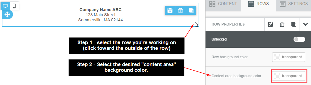
Row Background vs. Content Background – The row background is on display for desktop devices only. This is not an area where any content will be placed and a color that accentuates your brand/email aesthetic is the most critical factor here. The content background is the background of your actual email content. The width of this section is determined by the Email Width setting.
Header – The header is the top section of your email. This should always contain your company/brand logo. In many cases, brands like to also add in a menu here for quick access links to key pages on their website. The goal of the header is to clearly identify who is sending the email.
Hero Image – The Hero Image is your most prominent image in the email and always follows the footer. This image should be related to the content of the email exactly and help tell your story. The goal of this image is to capture attention, show off your product/service and amplify the response you are hoping to create from the recipient.
Content Blocks – Content blocks vary as this is the real “meat and potatoes” of your email. These contain your email titles/images/buttons/copy (AKA “content”) and can be formatted with a variety of layouts and aesthetics to match your brand/company.
Footer – The footer is the bottom most section of your email. This should always contain your company information (Mailing Address, Phone Number, Email) for spam compliance as well as any legal or compliance statements related to your products/services that may be required. This is also the location of where links to update email preferences or to unsubscribe will be located as well. If you'd like to change the background color of the footer, follow these steps:

By default, all emails designed in Ascent360 are responsive. This means that they will automatically stack rows with multiple columns and adjust the layout to the device size and orientation that will be used to display the email. However, it is still a good idea to make sure your designs render as you expect on both mobile and desktop.
Mobile and Desktop Views
Toggle between the Desktop and Mobile views in the top left of the email designer to preview stacking on different devices. When previewing the mobile version of an email, you'll be able to adjust content settings relating to font size, padding, and alignment for the mobile version of the email only. Mobile customization options are designated by the Mobile tag next to certain settings.
 The Mobile tag will turn blue to indicate the the changes apply only to the mobile version of the email.

Columns within the same row always stack from left to right unless Reverse Stack Order on Mobile is enabled on the row. 
Use the Hide On option associated with each content block to completely disable a content block for the desktop view or mobile view. This is helpful if you want to completely hide a block or tailor two similar blocks for different views.
 Use the Visibility Icon in the top left to toggle the visibility of hidden elements in the email preview.

Content Stacking
Content blocks will stack automatically, grouped by column, reading from left to right across a row. Use the desktop and mobile previews to view how content in your email will stack.

Use the Do not stack on mobile and Reverse stack order on mobile Row Properties to further customize the stacking behavior for a row.
Images are a critical part of telling your story and creating engagement with your recipients. Use the below recommendations and best practices to ensure images render as intended.
Optimal File Size
Tl;dr: Keep image sizes below 1MB. For your hero image, the ideal dimensions for desktop screens is 600-700 pixels (wide) and 300-500 pixels (tall). For mobile, that decreases to 350 pixels (wide) and 200 pixels (tall).
In addition to pixel width and height, consider the overall file size of the image. It is recommended to stay below 1MB for any image or graphic file -- this will help with email load times. In general, smaller file sizes are better.
Additionally, Apple devices feature a 2x resolution on their displays. We recommend you double the intended image size so it displays optimally on Apple devices. Example: if you need a 300px (pixels) wide image, crop and save the image at 600 pixels wide.
To determine the size of the image, consider how many columns are in the content block/row you are working on. For the Ascent360 Email Designer, this is easy to figure out based on the numeric value in the row properties of the designer. The largest value is 12 and that would be for a single column row. The row breakdown and sizing goes as follows (this table assumes the email width is 600px).
Column Value | Column Width (%) | Column Width (Pixels) | Image Width |
12 | 100% | 600px | 1200px |
10 | 80% | 500px | 1000px |
8 | 60% | 400px | 800px |
6 | 50% | 300px | 600px |
4 | 33.33% | 200px | 400px |
2 | .167% | 100px | 200px |
The image height will be dependent on the aspect ratio of the images being used. Make sure all images are using the same aspect ratio so when they are side-by-side they are the same width/height.
Note: you can crop and resize images within the A360 ESP (email tool). In the image 'content properties', click Apply Effects.

ALT Tags
Additionally, we recommend adding descriptive ALT tags to all images in your emails. These tags can be used to identify what the image is without the user downloading/viewing the image on their email client and they also assist visitors that require assistive software like screen readers or other text to speech software that read the page contents aloud to the user.
To add Alternate Text to an image, click the image element in the email design and type your ALT text in the Alternate text box:

Tips for Alt Tags:
Every image should have an Alt Tag unless the image is strictly decorative
The Alt Tag should describe the information of the image, not the image itself
If the image has information in it, the Alt tag should also have this descriptive information
All images and buttons within your email should contain a hyperlink so they link out to relevant content. Consider linking some text content as well.
Background images are not recommended as many email clients cannot properly render the code and end up displaying a solid color instead. If you want to create an image with text overlay, this should be done in an external program like Photoshop or Canva. The text will not wrap or scale with the image since it is not a live text overlay.
The Preheader is a valuable tool that allows you to set the text you would like displayed under the subject before an email is opened in the inbox.
For example, if you want to include the date of your "Day at the Beach" email in the preheader, you may configure the following:
- From Name: Company ABC
- Subject Line: Upcoming events at ABC
- Preheader: Day at the Beach is this Friday
Occasionally, the preheader will display extra text unintentionally.
For example, the pre-header may display as:
Upcoming events at ABC
Day at the Beach is this Friday ABC Corp 123 Main Street, Anytown USA Click here to unsubscribe
Another issue that is commonly seen is if the first content block on your email is an image, the preheader will show question marks.
Try the following solution to fix your preheader:
1. Insert an html block as the first block in your email.
2. Copy and paste the text below in the html block. This will create blank space that is ignored by Internet Service Providers except for within the preheader.
<!-- Insert ‌ hack after hidden preview text -->
<div style="display: none; max-height: 0px; overflow: hidden;"> ‌ ‌ ‌ ‌ ‌ ‌ ‌ ‌ ‌ ‌ ‌ ‌ ‌ ‌ ‌ ‌ ‌ ‌ ‌ ‌ ‌ ‌ ‌ ‌ ‌ ‌ ‌ ‌ ‌ ‌ ‌ ‌ ‌ ‌ ‌ ‌ ‌ ‌ ‌ ‌ ‌ ‌ ‌ ‌ ‌ ‌ ‌ ‌ ‌ ‌ ‌ ‌ ‌ ‌ ‌ ‌ ‌ ‌ ‌ ‌ ‌ ‌ ‌ ‌ ‌ ‌ ‌ ‌ ‌ ‌ ‌ ‌ ‌ ‌ ‌ ‌ ‌ ‌ ‌ ‌ ‌ ‌ ‌ ‌ ‌ ‌ ‌ ‌ ‌ ‌ ‌ ‌ ‌ ‌ ‌ ‌ ‌ ‌ ‌ ‌ ‌ ‌ ‌ ‌ ‌ ‌ ‌ ‌ ‌ ‌ ‌ ‌ ‌ ‌ ‌ ‌ ‌ ‌ ‌ ‌ ‌ ‌ ‌ ‌ ‌ ‌ ‌ ‌ ‌ ‌ ‌ ‌ ‌ ‌ ‌ ‌ ‌ ‌ ‌ ‌ ‌ ‌ ‌ ‌ ‌ ‌ ‌ ‌ ‌ ‌ ‌ ‌ ‌ ‌ ‌ ‌ ‌ ‌ ‌ ‌ ‌ ‌ ‌ ‌ ‌ ‌ ‌ ‌ ‌ ‌ ‌ ‌ ‌ ‌ ‌ ‌ ‌ ‌ ‌ ‌ ‌ ‌ ‌ ‌ ‌ ‌ ‌ ‌ ‌ ‌ ‌ ‌ ‌ ‌ ‌ ‌ ‌ ‌ ‌ ‌ ‌ ‌ ‌ ‌ ‌ ‌ ‌ ‌ ‌ ‌ ‌ ‌ ‌ ‌ ‌ ‌ ‌ ‌ ‌ ‌ ‌ ‌ ‌ ‌ ‌ ‌ ‌ ‌ ‌ ‌ ‌ ‌ ‌ ‌ ‌ ‌ ‌ ‌ ‌ ‌ ‌ ‌ ‌ ‌ ‌ ‌ ‌ ‌ ‌ ‌ ‌ ‌ ‌ ‌ ‌ ‌ ‌ ‌ ‌ ‌ ‌ ‌ ‌ ‌ ‌ ‌ ‌ ‌ ‌ ‌ ‌ ‌ ‌ ‌ ‌ ‌ ‌ ‌ ‌ ‌ ‌ ‌ ‌ ‌ ‌ ‌ ‌ ‌ ‌ ‌ ‌ ‌ ‌ ‌ ‌ ‌ ‌ ‌ ‌ ‌ ‌ ‌ ‌ ‌ ‌ ‌ ‌ ‌ ‌ ‌ ‌ ‌ ‌ ‌ ‌ ‌ ‌ ‌ ‌ ‌ ‌ ‌ ‌ ‌ ‌ ‌ ‌ ‌ ‌ ‌ ‌ ‌ ‌ ‌ ‌ ‌ ‌ ‌ ‌ ‌ ‌ ‌ ‌ ‌ ‌ ‌ ‌ ‌ ‌ ‌ ‌ ‌ ‌ ‌ ‌ ‌ ‌ ‌ ‌ ‌ ‌ ‌ ‌ ‌ ‌ ‌ ‌ ‌ ‌ ‌ ‌ ‌ ‌ ‌ ‌ ‌ ‌</div><!-- Insert ‌ hack after hidden preview text -->Dark Mode is an inverted app display where the background of the app is black instead of white and the text is white instead of black.
This feature is designed to reduce blue light exposure while also saving battery life. It is becoming increasingly popular amongst both desktop and mobile apps and email clients. With adoption of Dark Mode becoming more prevalent, it is critical to make sure you understand how your email may be impacted and how to optimize your emails for display in both light and dark modes.
Email clients (such as Gmail, Yahoo, etc.) render emails in dark mode differently. Some do not change the email contents at all while others invert all background colors and text. In some cases, an email featuring a black background may remain black in some email clients and in others may revert to a white background instead. To counter this, create a test list that includes multiple devices types and email clients -- to view how the email looks across a multitude of devices.
Focus on your email subscribers’ most commonly used devices/email clients, as those are most critical. It is not possible to design for all the iterations but it is critical to make sure the most popular amongst your email list are considered.
Optimize your emails for Dark Mode
- Images – Images are never modified for dark mode and will always display as intended.
- Images/Icons - JPG vs PNG format – JPG images always have a solid background whereas a PNG file can be displayed with a transparent background. Thus, a JPG image with a white background will display in dark mode with a white background as well. A transparent PNG will display the content background color so it is a good idea to ensure whatever content is in the PNG can display effectively on a darker background.
Product Image - Transparent PNG vs JPG w/ Solid Background:


Logo – Transparent PNG vs JPG w/ Solid Background:

TIP: For darker logos using a transparent PNG, place an outline around the image so it displays properly on dark mode.

- Background Color – The background is the primary change in dark mode where the white background inverts to black. You can control the variation of the color changes here. White will invert to black for example but a light gray will render out as a dark grey or charcoal. The same principle will apply to all color variations so darker colors will display lighter on dark mode and lighter colors will display as darker.
Example of background color inversion:


- Text Color - Text will follow the same guidelines as the background colors. It is best to use black or darker greys for text so they invert with good contrast on dark mode. Links can feature more branded colors so they still stand out as expected.
Example of text color inversion:


- Buttons – Same principles apply to buttons as well for both the text and button background colors. Best advice here is to make sure your button background color and text have good contrast and the text is highly visible.
Examples of Button Color Inversions:

 |


2025 Holiday Email Marketing Best Practices: Thanksgiving, BFCM and Christmas
The holiday season is a high-stakes time for email marketers. With inboxes overflowing and consumer expectations rising, your email strategy needs to be sharper than ever. Here's how to stand out and drive results this Thanksgiving and BFCM (Black Friday Cyber Monday) weekend.
1. Subject Lines That Cut Through the Noise
Your subject line is your first impression—and your best chance at an open. Keep it short (especially for mobile), clear, and urgent. Emojis and personalization can help, but avoid vague or overly clever phrasing. A/B test subject lines to find what resonates.
💡Pro Tip: Use countdowns or exclusivity cues like “VIP Early Access” or “Ends Tonight” to boost urgency.
2. Test Everything—Then Test Again
With so many variables at play, thorough testing is non-negotiable. Preview your emails across major clients (Gmail, Outlook, Apple Mail) and devices. Validate dynamic content and personalization logic to avoid embarrassing errors.
Checklist:
- Mobile-first design
- Dark mode compatibility
- Dynamic content rendering
- Link and image validation
3. Plan Your Campaign Cadence Early
Start building anticipation weeks in advance with teaser emails, early access offers, and wishlist prompts. Map out your full campaign flow—from pre-sale buzz to Cyber Monday follow-ups.
Suggested Timeline:
- 3–4 weeks out: Teasers & wishlist builders
- 1–2 weeks out: VIP early access
- Thanksgiving–Cyber Monday: Main offers, reminders, urgency emails
- Post-Cyber Monday: Retention & loyalty follow-ups
4. Deliverability Is the Gatekeeper
In 2025, inbox placement is tougher than ever. Gmail, Yahoo, and Microsoft now enforce strict authentication standards (SPF, DKIM, DMARC). If your domain isn’t properly authenticated, your emails may be blocked or land in spam.
Must-Haves:
- SPF, DKIM, and DMARC records
- Easy unsubscribe
- Complaint rate < 0.3%
5. Segment Smarter, Not Harder
Generic blasts are out. Use behavioral and transactional data to tailor your messaging. Start with simple segments like:
- Past Holiday Purchasers vs. Non-Holiday Purchasers
- VIP Customers vs. One-Time Buyers
- Engaged Subscribers vs. Dormant Contacts
💡Tip: Offer stronger incentives to less engaged or first-time buyers. Use loyalty perks or exclusive bundles for repeat customers.
6. Clean Your Lists—Now
Unengaged subscribers hurt your sender reputation and ROI. Before the holiday rush, prune your lists. Focus on active, engaged contacts to improve deliverability and conversion rates.
💡Bonus Insight: Brands that reduced sends by 70% and focused only on engaged subscribers saw a 50% increase in revenue.
7. Use Holiday-Themed Creative Thoughtfully
Festive visuals can boost engagement, but don’t overdo it. Keep designs clean, mobile-friendly, and aligned with your brand. Use seasonal colors, GIFs, and clear CTAs to drive clicks.
8. Be Ready for Throttling
ISPs may slow delivery during peak sending periods. Add buffer time between send and expected inbox arrival—especially for time-sensitive offers.
💡Best Practice: Send critical campaigns 2–3 hours before your desired delivery window.
9. Integrate Across Channels
Email works best when paired with social, SMS, and paid ads. Use consistent messaging and cross-channel reminders to reinforce urgency and drive conversions.
10. Ask for Help Early
If you need support with segmentation, scheduling, or deliverability, reach out to your email platform team early. The holiday season gets busy fast—don’t wait until the last minute.
➡️ Have additional questions on this topic? Let’s chat early so we can help you maximize results.
All emails designed in our email designer tool automatically have an opt-out (unsubscribe) link appended below the footer. This is not visible within the email tool, but will appear in both test emails and regular emails. This is what it says:

When a recipient clicks the link it will 1-click unsubscribe the recipient's email address.
If an email is forwarded and the 2nd person clicks the opt-out link, the original recipient's email address will be unsubscribed.
Note: Opt-out = unsubscribe. We often use these two words interchangeably, as they mean the same thing.
The autosave interval in Email Designer is set at 60 seconds after the last change to the email. If you try to navigate away from the email design page with unsaved changes, you'll get prompted to save or exit without saving.
As a best practice, we recommend not having the same email design open in multiple tabs/browsers, as you risk having an older version of your design save over a newer version.
What are web safe fonts?
Web safe fonts are fonts that are pre-installed on most operating systems and devices, ensuring consistent display across different platforms. They are crucial in HTML email design because many email clients do not support custom web fonts. Using web safe fonts helps maintain readability, ensures compatibility, and prevents formatting issues, providing a reliable and professional appearance for your emails across all devices.
What Fonts are Available in the email designer?
- Arial
- Bitter
- Courier
- Droid Serif
- Georgia
- Helvetica
- Lato
- Lobster
- Lucida Sans
- Montserrat
- Open Sans
- Roboto
- Source Sans Pro
- Tahoma
- Times New Roman
- Trebuchet MS
- Ubuntu
- Verdana
- ヒラギノ角ゴ Pro W3
- メイリオ
Font Stacks
Our designer uses font stacks. Font Stacks are list of fonts specified in CSS that defines the order in which fonts should be applied if the preferred font is unavailable. Font stacks ensure fallback options, maintaining readability and a consistent design across different devices and browsers.
- Bitter › Georgia › Times › Times New Roman › serif
- Droid Serif › Georgia › Times › Times New Roman › serif
- Lato › Tahoma › Verdana › Segoe › sans-serif
- Open Sans › Helvetica Neue › Helvetica › Arial › sans-serif
- Roboto › Tahoma › Verdana › Segoe › sans-serif
- Source Sans Pro › Tahoma › Verdana › Segoe › sans-serif
- Montserrat › Trebuchet MS › Lucida Grande › Lucida Sans Unicode › Lucida Sans › sans-serif
- Ubuntu › Tahoma › Verdana › Segoe › sans-serif
If you would like to learn more about web safe fonts, Campaign Monitor has a comprehensive email article titled All You Need to Know about Web Fonts in Email
Overview
Hospitality brands frequently ask whether marketing content can be included in transactional emails such as booking confirmations, itinerary updates, RFP acknowledgments, or folio receipts. In the United States, these messages fall under the CAN‑SPAM Act, and compliance depends on the primary purpose of the email.
Transactional emails may include limited marketing content, but only if the transactional purpose remains dominant. If promotional content becomes prominent, the message is reclassified as a commercial (marketing) email, which triggers full CAN‑SPAM requirements.
This article outlines what is allowed, what is not, and how hospitality organizations can remain compliant while still enhancing the guest experience.
Can transactional emails include marketing content?
Yes, but only minimally.
Under CAN‑SPAM, email classification is determined by the primary purpose of the message. Transactional emails are permitted to include some marketing content as long as the transaction‑related information is clearly central to the message.
Key Principles
Based on Current Industry and Regulatory Guidance
A. CAN‑SPAM Act Requirements
The Federal Trade Commission (FTC) defines a commercial email as one whose primary purpose is advertising or promoting a product or service. If a transactional email contains too much promotional content, it is reclassified as commercial and must follow all marketing requirements.
- Transactional emails do not require an unsubscribe link.
- Transactional emails may include minor, non‑dominant marketing content.
If promotional content dominates the message, the email becomes commercial and must:
- Identify itself as an advertisement
- Include a physical postal address
- Include a clear opt‑out mechanism
- Honor opt‑out requests within 10 business days
- Use truthful headers and subject lines
B. The “Primary Purpose Test”
Mixed‑content emails—those containing both transactional and promotional elements—are evaluated based on whether the transactional purpose is the dominant, most prominent content.
If promotional material is more visually prominent or occupies more space, the message is treated as a marketing email.
C. Current Best Practices (2025–2026)
Email compliance and deliverability experts advise that transactional emails can lose their exempt status if they include too much promotional content. Allowed elements include:
- One small cross‑sell module
- A low‑key banner placed at the bottom
- Light loyalty‑program messaging
However, adding multiple promotions, large hero images, or discount offers increases the likelihood the email will be treated as marketing and must include an unsubscribe option.
Recommendations for Hospitality: What is Safe vs. Risky
Safe to Include in a Transactional Email (Compliant)
These items are acceptable as long as they are secondary to the transactional content:
- A single small “Enhance Your Stay” or “Book Spa Reservations” module
- A subtle footer banner for loyalty sign‑ups
- Property photography that is non‑promotional (no offers or discounts)
- A link to general resort amenities or information pages
These additions are considered supportive content, not promotional.
Risky or Non‑Compliant
The following elements risk shifting the message into “commercial email” territory:
- Multiple promotional offers or upsells
- Discount codes, package deals, or rate promotions
- “Book Now,” “Save 15%,” or other strong marketing CTAs
- Large promotional hero images
- Any design element that visually competes with or overshadows the transactional content
These should be included only in dedicated marketing emails that contain opt‑out links and the required CAN‑SPAM disclosures.
Rule of Thumb: If you removed all transactional details and the email still feels like marketing, it will likely be classified as a marketing email under CAN‑SPAM.
Summary for Hospitality Marketers
Transactional messages—such as booking confirmations, RFP acknowledgments, and itinerary updates—may include light marketing content only when it is secondary and visually unobtrusive. Maintaining transactional dominance ensures the message remains compliant and avoids the need for marketing‑email disclosures.
When in doubt, keep promotional content:
- Minimal
- Clearly secondary
- Below the core transaction information
This maintains compliance while supporting guest engagement.
Sources:
